STH is getting “old” by many standards. It is rapidly approaching the end of its eighth full year. In preparation, it was time to do some updating on the overall site appearance which went live today. We wanted to share a bit about why, since we have done this several times and there are always groups who prefer the old versions. We know that our readers are sensitive to ad space, and we believe this new re-design is far from overburdensome and should decrease our ad views by 5% or more.
HTTP/2 Support
We were the first major hardware site to switch over to HTTP/2 and even HTTPS when we did this last year. We expect HTTP/2 to become more widely adopted so we wanted to optimize for a HTTP/2 future, not a HTTP past.
For those wondering, we are going to be doing a major overhaul of the STH forums. That platform went HTTPS first but the stack is aging.
HTTP/2’s parallelism does change how we view the web infrastructure so we have some behind the scenes optimizations that went into place recently.
A New Look for STH
Moving ~8 years of content is never easy. Small experiments turn into headaches to maintain. Something invariably breaks. On the flip side, there are many factors that were pushing for an overhaul.
We have seen an increase in mobile traffic, albeit much lower than the average site given our audience. The old layout was in the days just before mobile layouts became a factor in search result ranking.
The fact is, the average page size of STH has gone up considerably. Whereas in 2012, for example, a review may have had 5-7 images, many of our larger reviews (e.g. QNAP TurboNAS TS-453A 4-Bay NAS Review) can have upwards of 20+. As a result, we are changing how some of these images get served on the web infrastructure side. One example you are likely to see is “lazy loading” where images will load as you scroll down a page. Simply put, this needed to happen.
Aside from the visual elements, we are going to have access to better page formatting which should help us considerably going forward as we expand the article types we support.
There are still a few cleanup/ migration items, and a number of tweaks we will be making over the next few days and weeks, but we hit a point where it was time to use the holiday weekend to pull the trigger on the upgrade. We needed to get on the platform to deliver the next set of STH features over the upcoming year.
Hot Topic: Ads and Ad Space
Ads are a necessary part of keeping this site running as they are the main source of funding. We do realize that some sites have been increasing ads at a significant rate both in terms of quantity, as well as the “aggressiveness”. We are taking a slightly different approach.
In early 2016 we started experimenting with a novel concept, using fewer ads. By Q3 2016 we had dropped the number of ads each visitor saw, on average, by 11%. We actually saw about a 1% increase in ad revenue from that which is awesome.
The new re-design should decrease this by another 5-8% and we will have more solid numbers as metrics come in.
I do look at other sites in the category and check out ad space. As a quick experiment, I picked five popular hardware sites and accessed them just as the STH refresh went live. The sites were Tom’s Hardware, AnandTech, PC Perspective, [H]ardOCP and Tweaktown. I also accessed STH logged out. We do not have user registration for the general public on the main site. All five were screenshotted. I then did a quick exercise to block ad space and compare how much screen real estate we use versus others.
Here are the results with pink being used to designate ad space. I use a 43″ 4K monitor and work side-by-side with windows so apologies that these are large. This is not a comment on which one is right, the most successful are doing the opposite of what we are doing. Instead, we just wanted to give some comparative data points regarding how the redesign works for us.
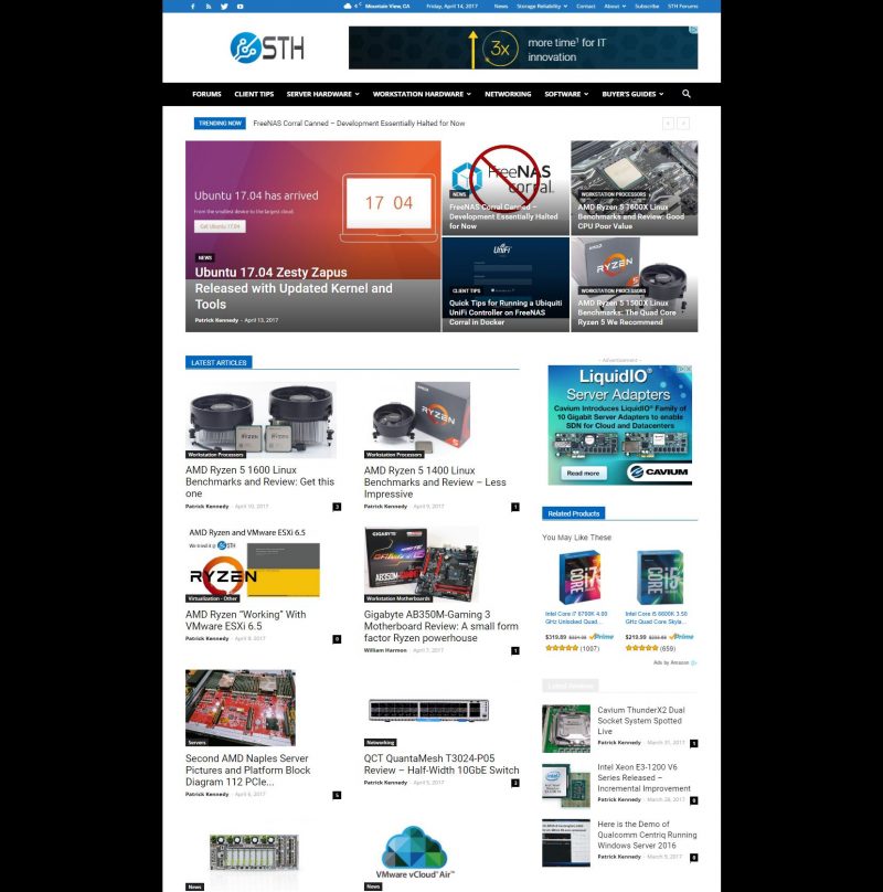
First off, the STH refresh ad space at launch:
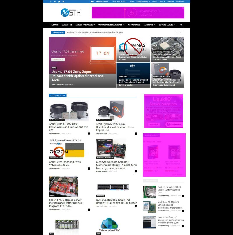
As a note, there are no other ads on the page which is an anomoly in the group.
Tom’s Hardware:
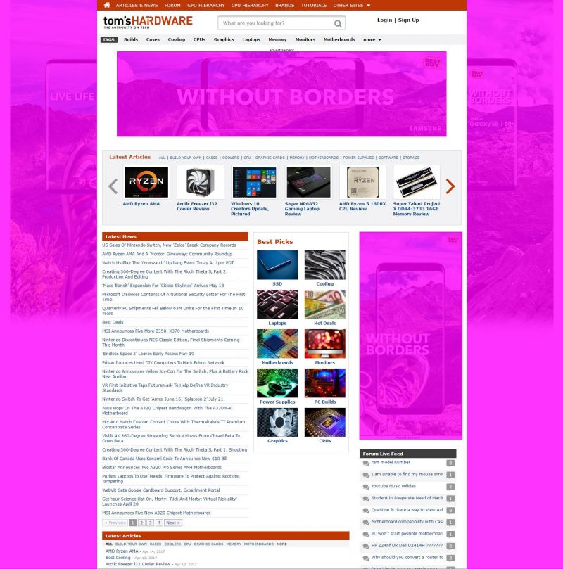
Tom’s is one of the oldest tech sites out there and is owned by Purch, the largest tech publishing conglomerate.
Anandtech:
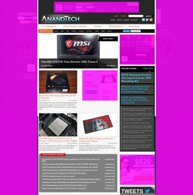
AnandTech is also owned by Purch yet follows a slightly different formula.
PC Perspective:
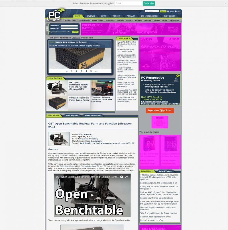
The PC Perspective team also does not utilize the side ads and have a fairly limited ad real estate usage.
[H]ardOCP:
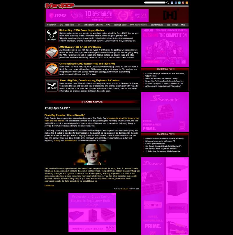
Tweaktown:
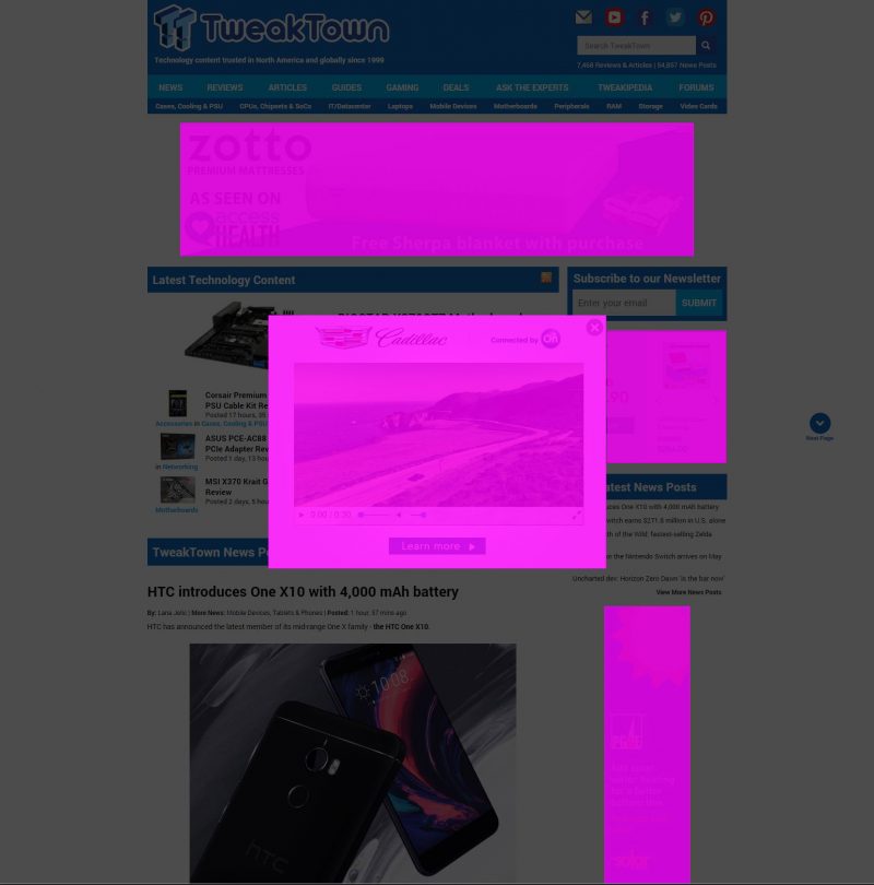
The reason Tweaktown looks a bit darker is that an autoplay Cadillac ad was shown in a full page overlay. On the flip side, that did also block a slight portion of the ad below.
Given this exercise, I think the new STH re-design uses the least amount of real estate among the group. There are a few big reasons behind this.
All of our ad space is 100% outsourced. We do not have an in-house team pushing for more ad space and spend. Instead, Google/ Amazon and etc. algorithm driven matching to the space we have.
Although I get pitched 2-3 times a week by ad tech firms looking to sell overlays and side area ads, I personally do not like them. I often inadvertently click while trying to use touch scrolling.
Finally, when we made the decision last year to pull back on the amount of ad inventory, it was likely the wrong move financially. When we look at larger web properties, ad real estate grows revenues. That is a fancy way of saying, we are exceptionally worse at driving revenue than other tech sites.
Final Words
Do you see something broken? Stop by the STH forums and let us know. We have a list of bugs that are still present and have plans to resolve. We expect to deliver new features and continue to improve the usability of the design over the coming quarters.

