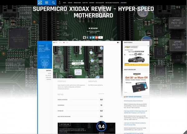
For those long time readers, STH has just gone through a major re-design. The old look was established in December 2012 and was a major upgrade at the time. In December 2012 we established the formal review and rating system that we have used for the past 2.5 years. At the same time, the STH design was not user friendly, especially on Retina level display resolutions. It was time for a change.
Why the change?
There were really three factors leading to the change. Google, Freshness and Features.
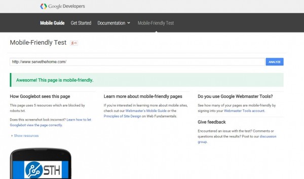
- In April 2015 Google is changing its ranking algorithm to put a bigger weight on mobile friendly designs. Simply put – it needed to be done to maintain Google rankings. If you do have a website, there are only a few days left to get mobile friendly. STH now passes the check.

- In terms of freshness, the old STH design was fine, but it was looking very old and tired. Perhaps most to me since I have been staring at it daily for almost 1000 consecutive days. Given, the current design is far from perfect, but it is time to do something new with the site.
- Features, this is another big one. We have been limited for some time now by the features we have with STH. We wanted to add a few relevant features for today. One example is that we will likely start testing user ratings in the near future alongside our editorial ratings. Another is that we have been limited to 600 pixel wide images for some time now. With even mobile phones having at least double that resolution, we finally will have the ability to use higher resolution images in our reviews.
One other note – we also removed a LOT of legacy code with this re-design. The next architecture overhaul will happen soon but we needed to clean up some WordPress code first. STH is just shy of 6 years old now so, as one can imagine, code that worked as a 10 visitor/ day site does not work as the site now is holding a top 100,000 worldwide Alexa ranking.
The key takeaway here is that there is quite a bit happening in terms of the STH and related site upgrades over the next few weeks. Last week we transitioned to a new larger colocation cabinet with faster servers SAS hard drives and yet another backup layer:
And so it begins! the new colo transition has started. pic.twitter.com/GCd8TYonUi
— STH (@ServeTheHome) April 10, 2015
We also have a big update coming to Linux-Bench soon which will be much easier to use. All of this leads to a lot of investment happening at STH to take the next step in making the site even better for the millions visiting STH every year.


I don’t like the logo, menu button and the search, and the left bar, it seems like it’s marked and I use like 20 seconds to realize it wasn’t….
I find it absolutely awfull, be it on my home PC (27″ 1440p) or at work (1600×900). I can only see one news entry at a time, with gigantic paragraph title, and text barely readable (very thin gray police on white background).
What have you done ? It’s very very difficult to read, and I will have to stop reading your site, or I’ll have to copy’n paste in notepad++…
I don’t think any site can render well on mobile dervices and on PCs. I never use mobile devices, except for very specific tasks (remote control squeezeboxes… ) because I find them very very uncomfortable (you can’t imagine how pleased I am when coming back home and sitting in front of my 1440p IPS screen). Frankly, for a professional-oriented website, it seems to me like a very very bad idea.
I like it a lot. So much better on my phone now. Heck even on my desktop it’s less old and tired looking.
And this redesign is absolutely ten steps backwards in terms of usability. It is just butt ugly. Icons and graphics are way too big for traditional 100dpi 20-24 inch displays, and color schemes are too light to separate the contents. Why waste all the energy to cater to mobile just to maintain the “ratings”?
Soory, I really don’t like it. Right now I’m typing this comment blind, because the “previous article” arrow covers the comment box.
The top and left side looks totally cramped, and like it is highlighted (I was clicking at first to try to unselect it until I realized that it is supposed to look like that.. And somewhere while scrolling the blue suddenly goes away for a second)
Way to many animated elements. I scroll to see content lower down on the page, not to trigger fancy animations.
The teaser image constantly flashes to white.
Texts seem harder to read as well.
TL;DR: very buggy, broken&ugly enough to turn STH from “browse occasionally” to “only search if wanting a specific article”
I think it looks more modern. i don’t like change but f* this site loads so much faster than storagereview. I like it much.
I really don’t like the new design, it should be able to detect screen resolution or browser and present mobile or desktop version of the site. I found it less usable.
nobody found, that when you list to older articles, url does not change? so disabled back functionality in browser .. or im back on site where i was before i enter STH … Also i tried STH on mobile device .. not usable at all .. (lenovo 8inch tablet with android and opera classic ..