Micron has a new corporate logo. Gone is the orbit around the M and in are the new curves. Since we use a ton of Micron RDIMMs as well as some of their SSDs, this is a notable branding change. Of course, we love to hear what you think about it.
Micron Has a New Logo
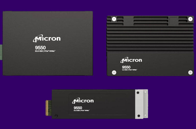
Here is a good look at the old logo on the Micron 9550 SSDs where we can see the orbit around the M.
Here is the new logo that we received from Micron.
With any branding change, we always get some mission statement or design philosophy. Here is what Micron sent STH:
Inspired by the curves and colors of its silicon wafers, the new logo design embodies what is at the core of Micron’s technology leadership: staying ahead of the curve – anticipating future needs and driving the next generation of technology. Innovation and rapid execution are central to Micron’s vision of transforming how the world uses information to enrich life for all. (Source: Micron e-mail to STH)
Micron is behind the initial curve on the M, but ahead of the trailing curve on the right. Maybe it should be that Micron wants to sit in the sweet spot of the technology curve.
Final Words
Branding notes aside, what do folks think of the new logo? It is certainly less drastic than the 3rd generation Intel Logo re-design, which also included sweeping product name changes. Micron seems to have gone with more of just a logo change. Personally, I am neutral on the change. Still, a lot of us see this logo all the time, so if you feel strongly one way or another, that is what the comments section is for.


I think I like the old one better.
Eww.
Why are all these companies in a race to remove any unique identity from their corporate logos and replace them with simple type fonts?
@James – agreed. These new logos have no character, no soul. I hope marketing departments wake up realize this design trend is not the way to build stronger brand recognition.
Intel’s decline began with the transition to the orbital logo in 2006 :) Intel in turn was inspired by Samsung. It will do Micron good to get rid of any allusions
I really don’t get why they spend the time/money to do so. Being enterprise they could just be a QR code logo…..
Did the EEs get together to convince the marketing department that adding squiggles to the font would improve brand transmission integrity? “It’s just like PCB trace length matching, you see…”
I had an insightful comment about the electronics industry’s choice in logo changes, but the forced refresh cycle ate it. Thanks, STH.
I don’t mind the look of the new logo, it seems more modern, but I do agree that it’s way more generic. You only need to see the “M” from the old logo on a chip to immediately know who manufactured it, but that new “m” is not going to stand out much at all.
The skinny letters evoke weakness. The soft curves are effeminate. Looks more female hygiene product than computing equipment. Agree with the other thoughts on how generic it looks. Definite regression here.
I actually like the understated branding, it fits better with modern design philosophy. Using the old logo in branding with a lot of whitespace makes it look like a 2000’s OEM
you can only get the most boring things possible through a large enough round of committee sessions talking about it.
I wonder how much they paid for new logo to be “designed”?
The old logo is better… as with every other new logo.
its good, nice compact font, evokes “small”, or micron.
ᙏ¡ᙅɼ❍ɳ
There are many great alternatives in Unicode, the above found at ShapeCatcher.
To celebrate the new logo (not really), I just bought 2x32GB of ECC DDR4…
Looks stupid.
Don’t like it at all.
Supermicro Next…
Yeah, I like the old “orbit M” form better. More recognizable, unique and just plain fun. The new form is merely…plain. And flat. I’m kind of in agreement with those saying the new logo is a bit boring. The push to “simplify” everything is just making everything boring and plain. I liked Intel’s dropped lowercase “e”. They had that since their founding. Then they changed it to the oval-enclosed “intel” with a lowercased “i” and finally we have just a plain, semi-generic “intel”, the dot over the “i” being a lighter shade of blue than the rest of the logo. Not entirely ugly, but the original 1969-era Intel logo will always be the one I like most. Can’t replicate that dropped “e” conjoined with the “t” and the “l” in Unicode, as far as I am aware.
Retrograde.
This is evidence they have too much money and too much time on their hands.
utterly breathtaking
I see everyone talking about looks in large prints. I think the real ugliness and coplete loss of identity will be on the ICs where the very small sizes will make em look like basic “m” rather than the nicely branded M with an orbit currently present.
Looks ok. I hope they keep the M logo on their chips although it’s very unlikely.
The new logo creeps me out. It looks like a computer added the logo as something from a previous web page.
I didn’t know folks were so opinionated on the design of a logo for computer junk hardly anyone sees.
Who cares?
They said the letter “m” looks like an elephant while the letters “on” looks like a man bowed down (orz). Could it be a coincidence or it’s intentional? Hmmm…
A well-designed logo can make the company more recognisable.
Just stick to the one which is more appealing.
A logo alone can’t sustain a business if the elements of quality, services, company reputation, etc are lacking.
For me, thumbs down on the new logo
Feel like a toy brand logo, un-tech and un-remarkable
The lowercase lettering makes MICRON look small and insignificant.
I hate the new logo. It looks weak. Some things shouldn’t be changed. Please don’t let Coke and Ford change their logo.